10/5/2024
-
4
min
We've just launched an to Barbara 2.7.5, a version focused entirely on enhancing your user experience and a big step in our journey to make Barbara the most UX-friendly Edge AI platform in the market.

As a user of Barbara, you will have probably experienced that the UX is one of our main concerns; we believe in the design principles that say “the less you need to explain about how things work, the better the experience users will have”. You've just received an upgrade to Barbara 2.7.5, a version focused entirely on enhancing your user experience and a big step in our journey to make Barbara the most UX-friendly Edge AI platform in the market.
You will see a set of small but important changes that will (hopefully) make your life easier. Let’s explore why this is important to you!
You now have direct control over how your edge node connects to the internet, empowering you and your team to configure settings locally without going through the Barbara Panel dashboard. That is what the Standalone Mode is for.

When enabled, the node will no longer obey the network configuration defined in the “Networking Card”. Instead, you will be able to locally connect to the node and, through a web interface, configure the connectivity settings.

You will now focus your attention on the important stuff and won’t get distracted by the visual noise that our previous header presented.

We have reduced the visual impact of the different header options so you get a better overview of them without getting lost.
As you probably know, every edge node’s information is presented and interactable through widgets called ‘Cards’ (check this article in Academy for more details). We already made big improvements in version 2.3. in the way the information was shown; we are now going further by reorganizing this information and how you can interact with it.
You will now find the most important information at the top, allowing you to quickly access what you need most. Additionally you can now hide the segments of information you are not interested in so you can save space within you dashboard and customize it as you want

When you work with Dockers there is certain information you want to have easily available and accessible. That is the case of the Volumes information and the Credentials and Secrets you use within your dockerized apps. This information was a little bit hidden and difficult to find so we have decided to give them their own entity and create new cards so you can easily interact with them now

According to users like you, the main interactions within this card are related to the VPN and the Proxy. That’s why we have decided to put them above the rest of the options so you find them quicker.

Additionally, there were situations where certain nodes had so many network interfaces that the card got too long. To avoid that you will now see just 5 entries (VPN, Proxy + 3 network interfaces) and a scroll to browse to the rest.
Having too much information is sometimes overwhelming, and that was starting to happen to some of the system information cards such as the Telemetry, the Analytics and the General Info ones.
In order to alleviate the visual overload we have redesigned them. You will now see in a glimpse the most important information; the rest will be accessible at a second level by using contextual buttons and menus.

You will also feel some other user-experience improvements in Panel such as the organization of options in the lateral menus, more clear error messages when something wrong happens, a simpler-to-use Global Config card or some minor changes in the typography so you can read everything more comfortably.
Explore these new features and see how they make your work with Barbara more intuitive and efficient. We welcome your thoughts and feedback on these updates!
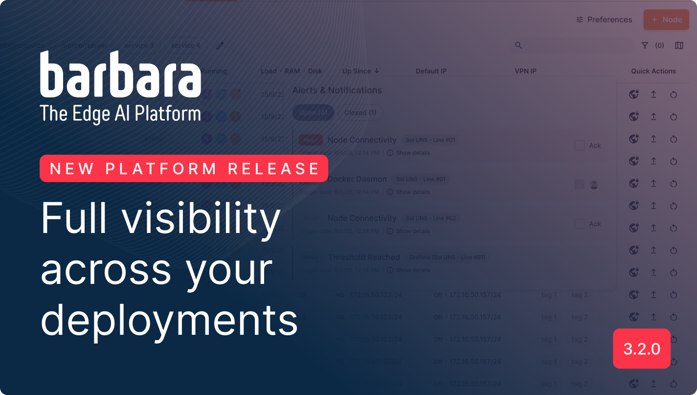
Barbara 3.2.0 is here full of brand new features to make your life easier. A new dashboard, a new map, alerts and notifications and much more. Let's explore what it brings!

Barbara Platform v3.1.0 marks a major leap in edge computing by introducing High Availability (HA), bringing cloud-grade resilience, fault tolerance, and uninterrupted uptime to edge environments. Leveraging Docker Swarm, this release enables users to create robust clusters, maintain persistent data, and ensure seamless service continuity, even during node failures or updates. Know more.

We’re excited to announce a highly requested feature: the unified log viewer. Quietly introduced in version 3.0.1, this powerful addition brings clarity, flexibility, and control to your real-time application monitoring.


